Food & beverage Rebranding 2026

Yewale Amruttulya

Yewale Amruttulya sells strong, consistent chai across Maharashtra at prices students and daily-wage workers can afford. The chai was never the problem. The rebrand had to move the shop from roadside tapri to something closer to a café, without losing the people who come every morning because it is cheap.

  • RoleBrand identity
  • ScopeAudit, positioning, logo, palette, typography, applications
  • Year2026
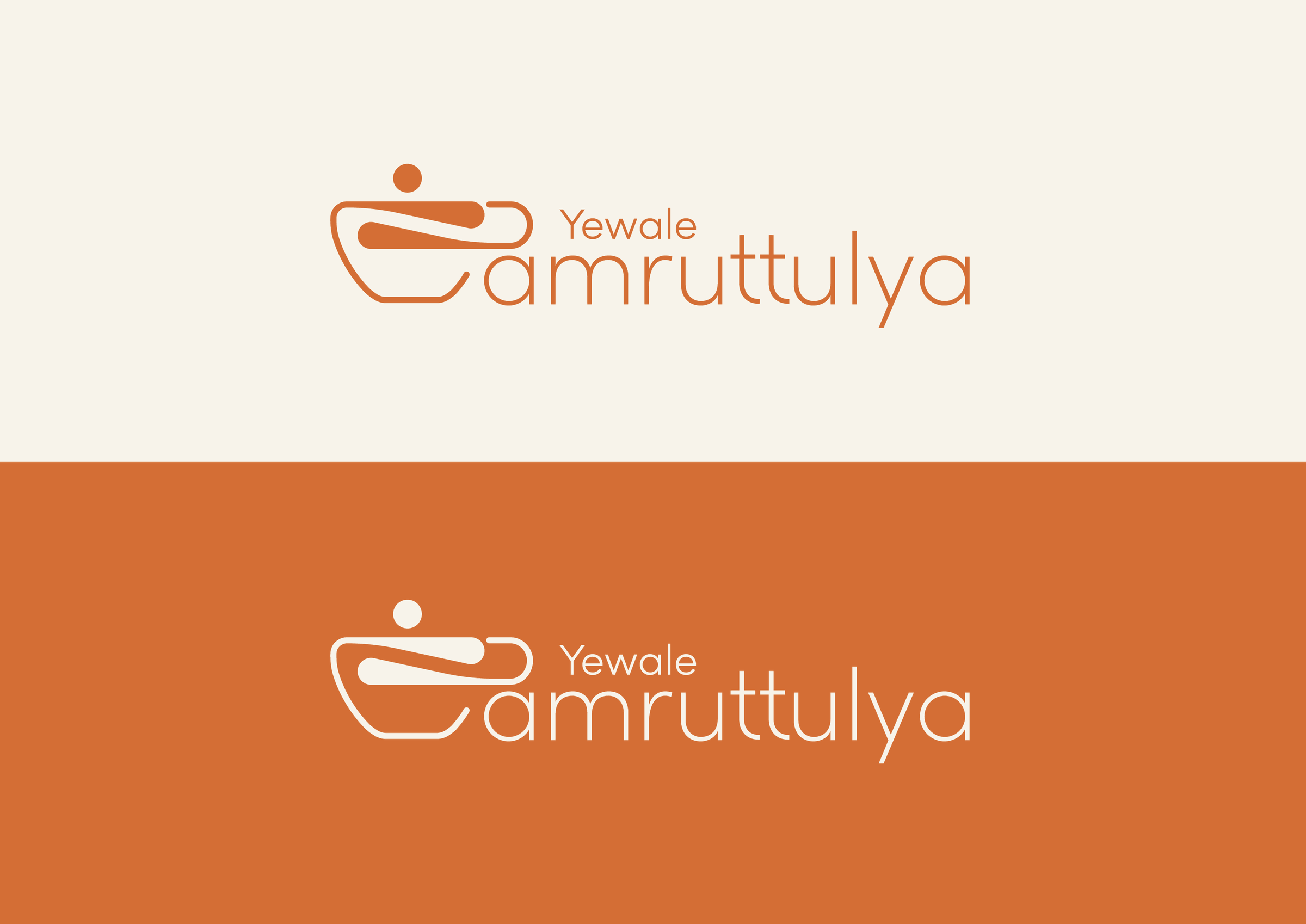
The Yewale Amruttulya lockup in both colourways: terracotta on cream above, cream on terracotta below
The audit

Known for the chai, not the room

Yewale Amruttulya started in Pune and built its name on one thing: strong, consistent chai at a price nobody has to think about. Simple store setups, high footfall, and a loyal following among students, workers and middle-class families.

That reputation is also the ceiling. Brand recall drops off outside Maharashtra, the business leans on a single product category, and the store experience reads as functional rather than considered.

The taste was already the strength. What the brand lacked was a room worth sitting in.

The move

Between the tapri and the café

The repositioning puts Yewale in the gap nobody occupies: a mid-luxury chai brand, above the roadside tapri and below the high-end café. Affordable-premium pricing, clean and rooted surroundings, the same familiar cup.

The work runs through updated branding, refined interiors, better packaging and a shift in tone, aimed at urban centres, high-footfall areas and upscale neighbourhoods.

The hardest part is perception: the brand is still shifting from mass to premium in people’s heads, and the price has to stay where it is while it does.

Who it is for

The everyday, made a little better

The audience is young professionals, modern families and urban millennials who want strong, traditional chai in a clean and stylish setting. They value quality, comfort and a touch of elegance in a drink they have every single day.

  • DemographicAges 18 to 60, all genders, students through to daily-wage workers, on low to middle incomes
  • BehaviouralRegular tea drinkers with a daily morning or evening routine, loyal to local flavours
  • PsychographicCommunity-oriented and brand loyal, favouring homegrown names over large chains
  • GeographicUrban and semi-urban Maharashtra, near colleges, offices and markets, expanding outward
Two customers

A break, and a place to sit

  • Rohit Pawar · 30 · Pune
    A sales executive who needs a quick, energising break in a working day. Wants a strong, reliable cup every morning; dislikes long queues and paying café prices for basic chai. “Chaha hava pahije… pan jast kharch nahi.”
  • Aarti Deshmukh · 21 · Mumbai
    A design student who meets friends somewhere cheap and comfortable. Wants a budget-friendly, peaceful space to sit, talk and study; avoids loud, crowded or overpriced cafés. “Simple vibes, strong chai – that’s my kind of place.”
Where it stands

Strong locally, unknown nationally

  • StrengthsStrong regional presence, affordable and consistent pricing, a loyal base, an authentic local taste
  • WeaknessesLittle expansion beyond Maharashtra, low recall elsewhere, dependence on a single product category
  • OpportunitiesPackaged tea in FMCG, franchise growth, digital delivery platforms, merchandising
  • ThreatsNational chains like Chaayos and Chai Point, rising raw material costs, shifting urban tastes, aggressive new local entrants
A daily luxury everyone can afford.
The promise

Tradition, kept and raised

Mission. To preserve the rich tradition of Maharashtrian chai while offering it in a refined, welcoming space that blends heritage with contemporary design: a consistently strong cup, made with care, served with warmth, priced so it stays a daily habit.

Vision. To become India’s most beloved chai brand, known for turning an everyday drink into a cultural ritual, expanding nationally without losing its roots.

Values. Tradition, quality and simplicity, in a clean, comfortable, slightly refined setting.

Authentic Maharashtrian chai, brewed to perfection, served in a refined setting: the richness of tradition with the comfort of modern luxury, at a price you can enjoy every day.

The brief for the mark

Twelve words the logo had to hold

The identity work started from the vocabulary, not the shape. These are the words the mark had to carry before a single line was drawn.

  • RootsAuthentic · Maharashtrian · Heritage · Community
  • FeelingWarmth · Comfort · Inviting · Rich aroma
  • RegisterPremium · Refined · Daily indulgence · Gold and earthy tones
The mark

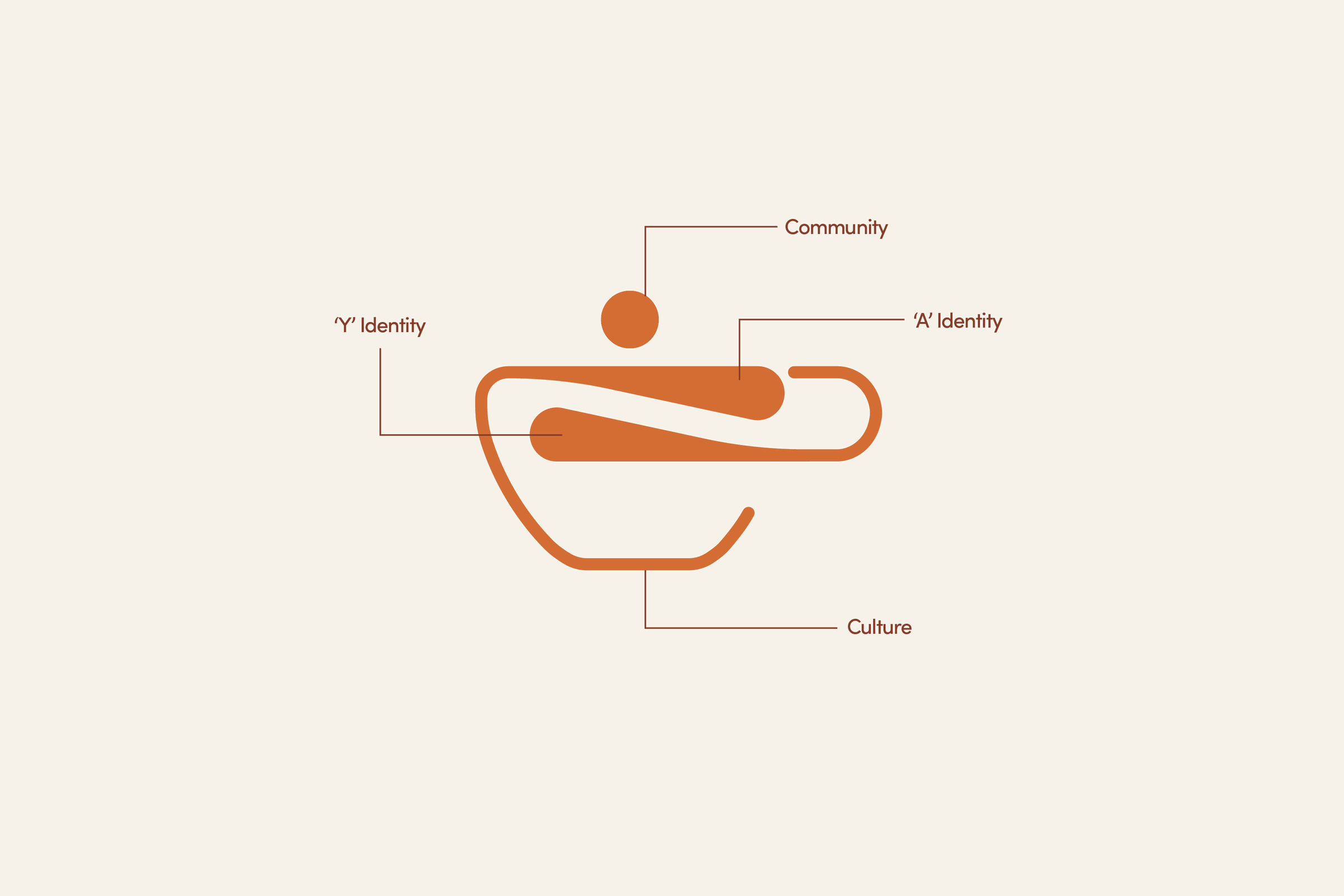
The cup is the whole idea: a bowl of chai seen from the side, with the brand’s own initials folded into it. The A and the Y are the vessel, not decoration on top of it, which is what lets the mark hold at the size it is actually seen — on a cup, at arm’s length, in a hurry.
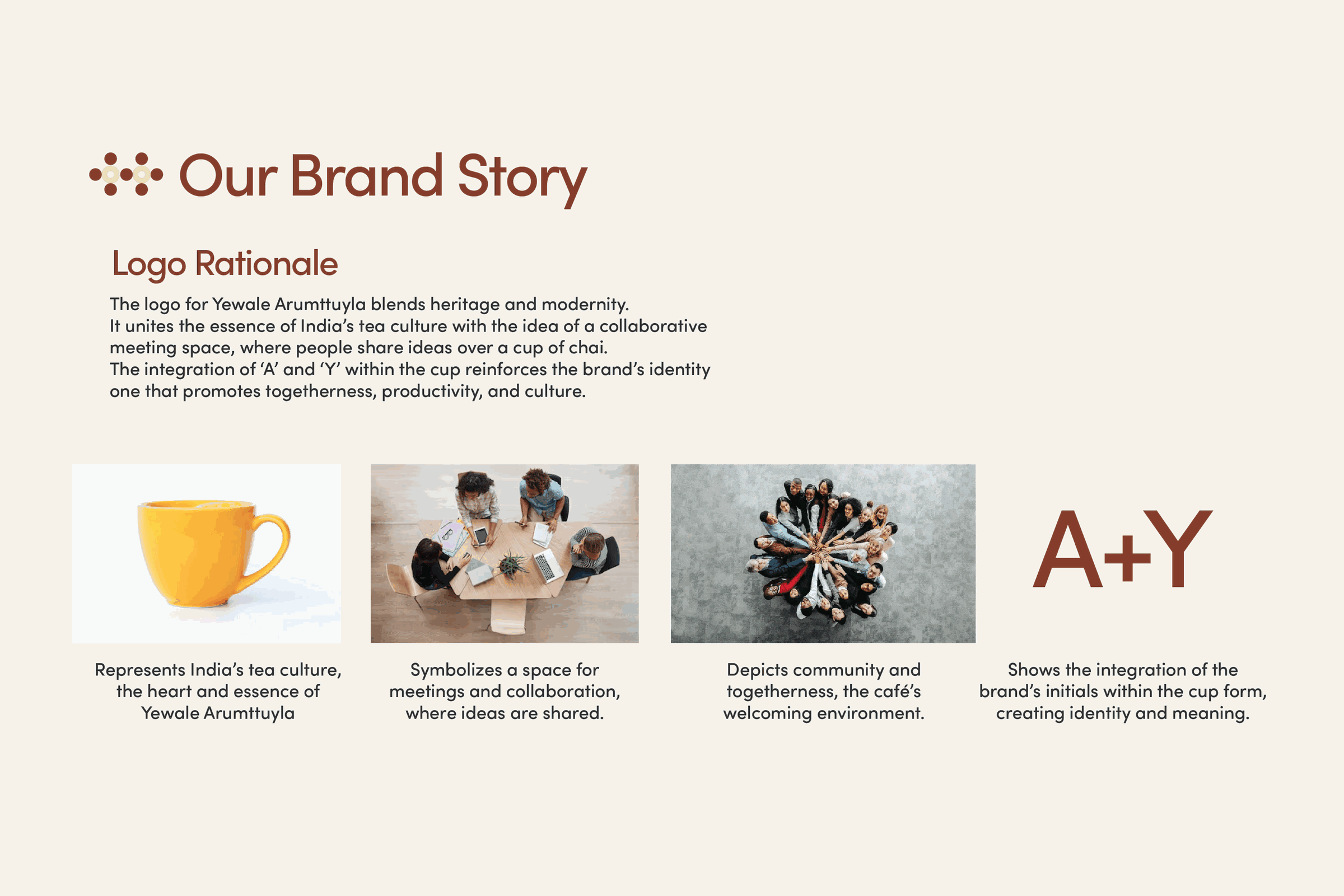
The brand story page: the logo rationale set beside a cup of chai, people sharing a table and a group in conversation, ending on the A plus Y construction
Logo rationale
The mark annotated: the Y identity and the A identity inside the cup form, labelled out to community and culture
Anatomy
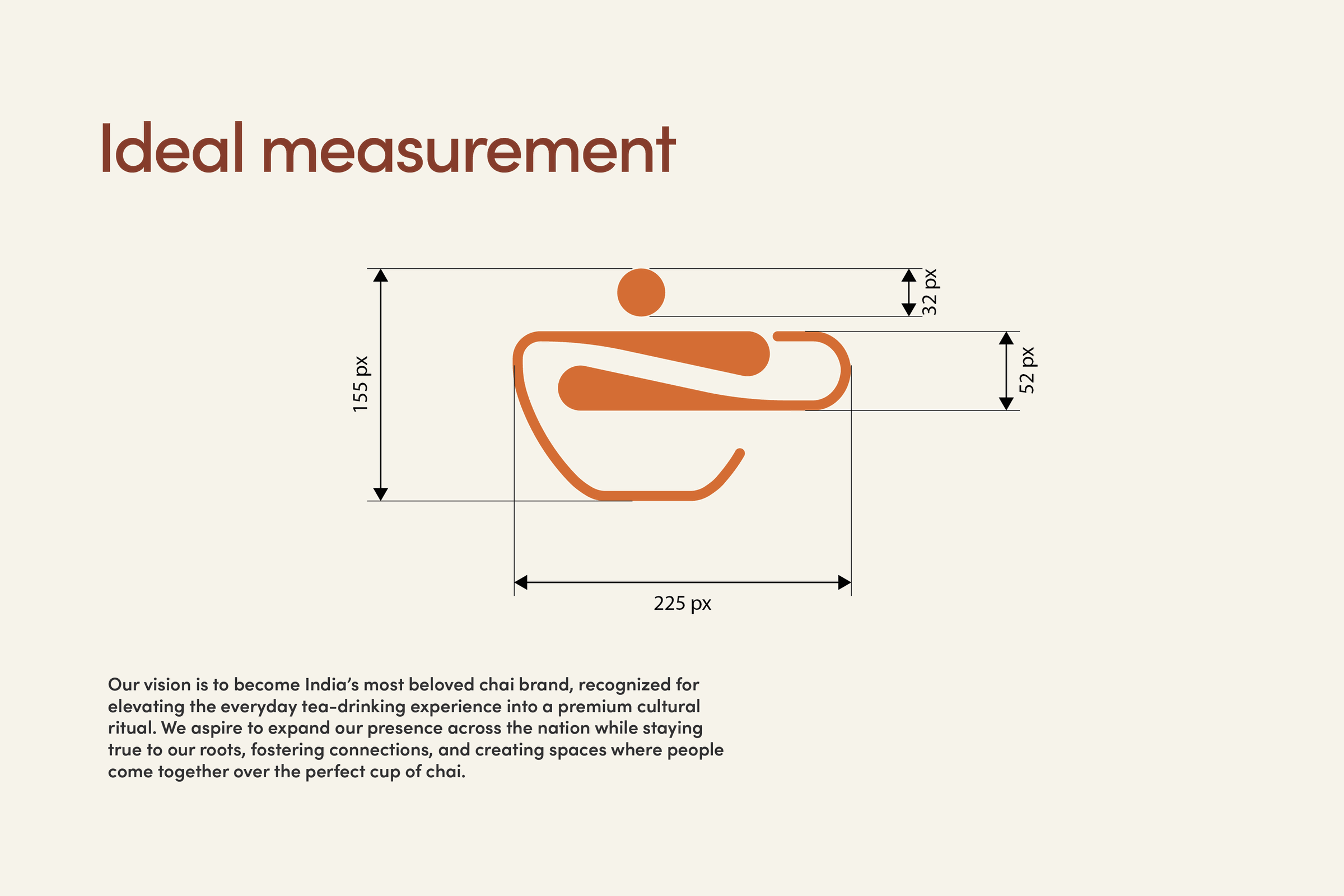
The ideal measurement drawing: the cup mark at 225 by 155 pixels with the clear space dimensioned around it
Ideal measurement
The lockup in both colourways, terracotta on cream and cream on terracotta
Colourways
Palette & type

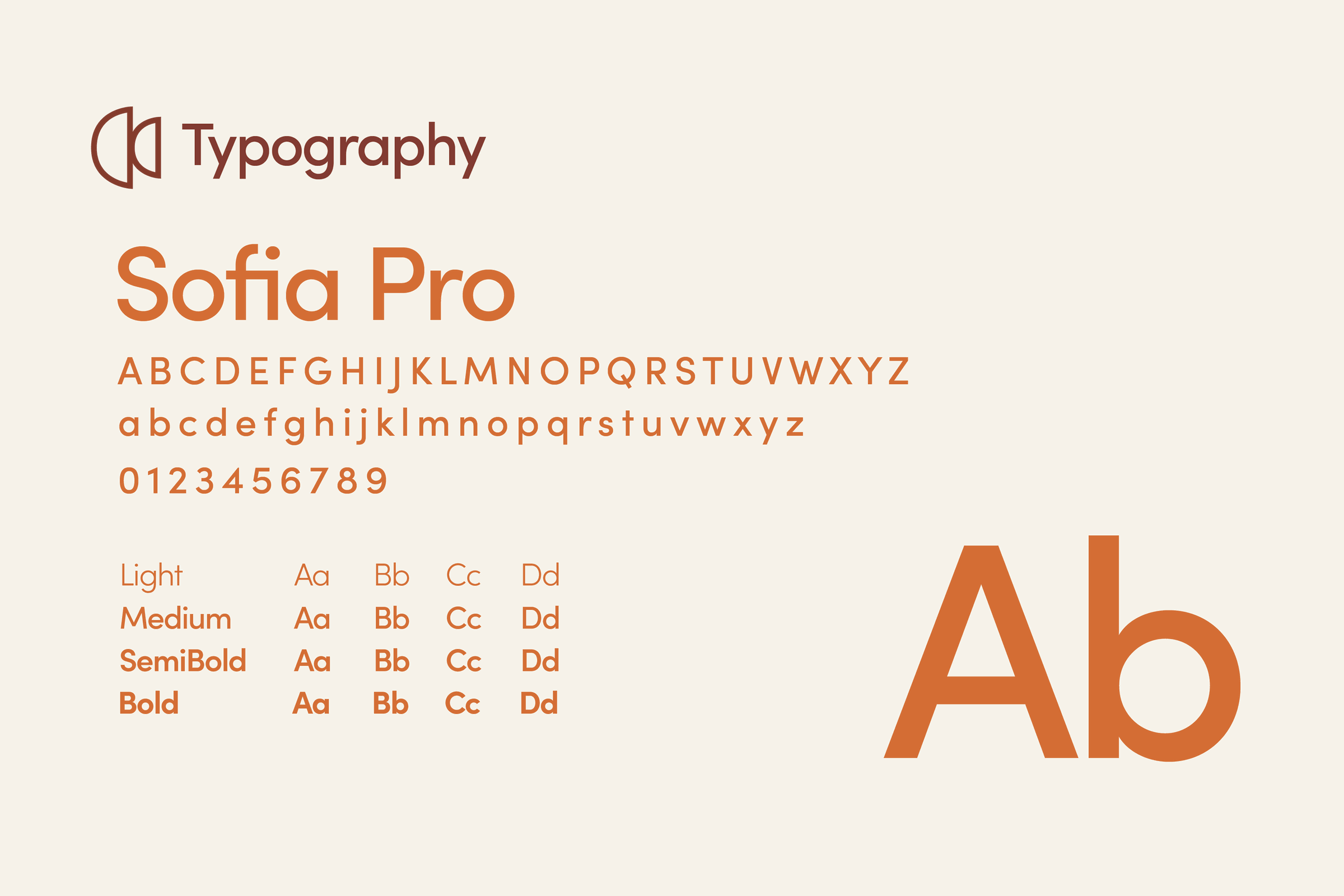
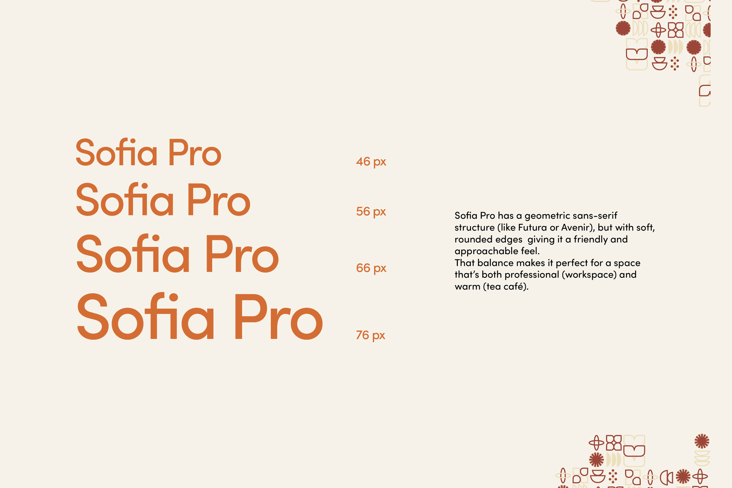
Terracotta #CA6627, Pantone 7579 C, drawn from Pune’s own red brick and late afternoon light: local without being costume. Sofia Pro sets everything, a geometric sans with soft, rounded edges — professional enough for a workspace, warm enough for a tea shop.
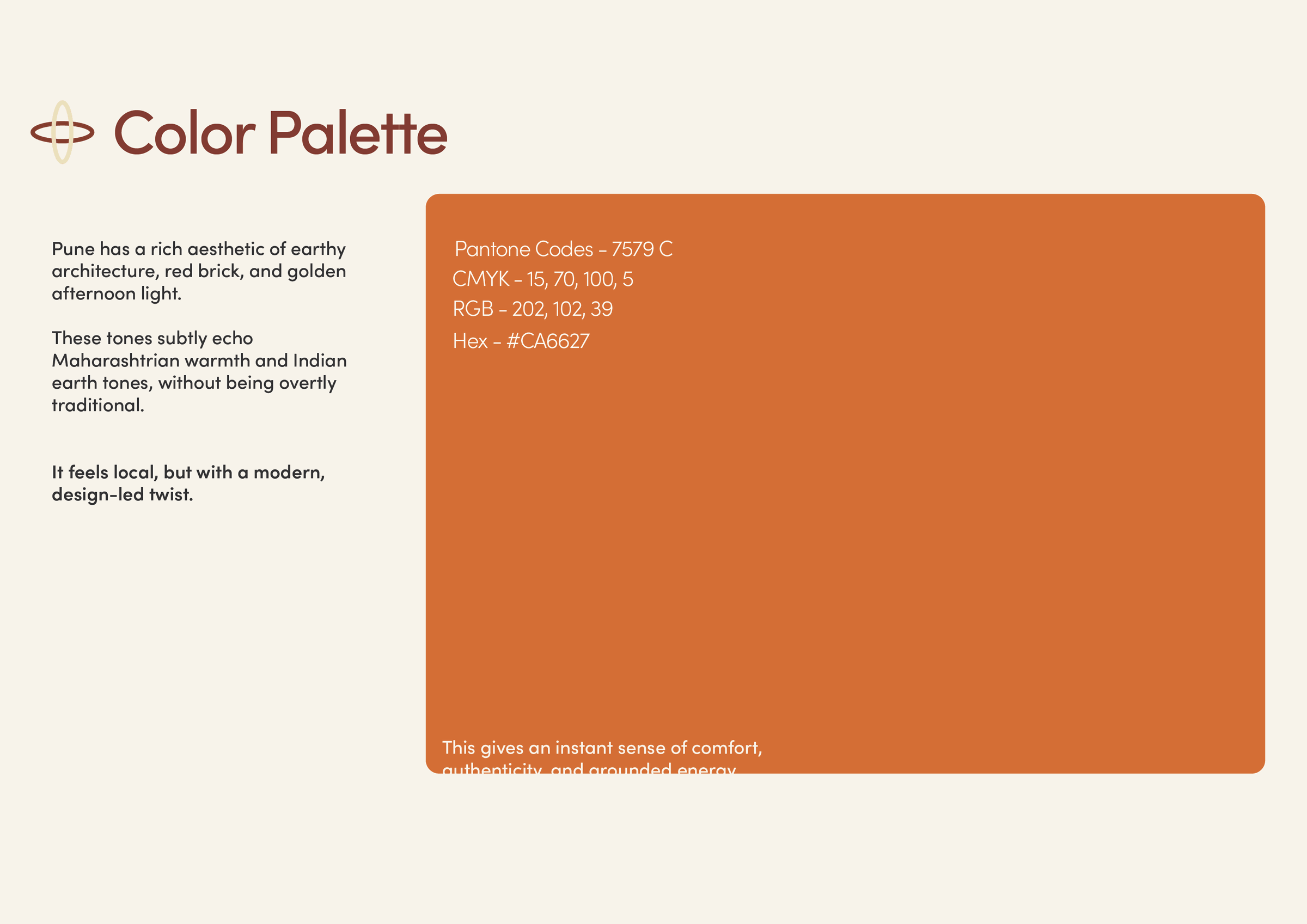
The primary colour page: a terracotta field with Pantone 7579 C, its CMYK, RGB and hex values, and the reasoning behind the choice
Primary
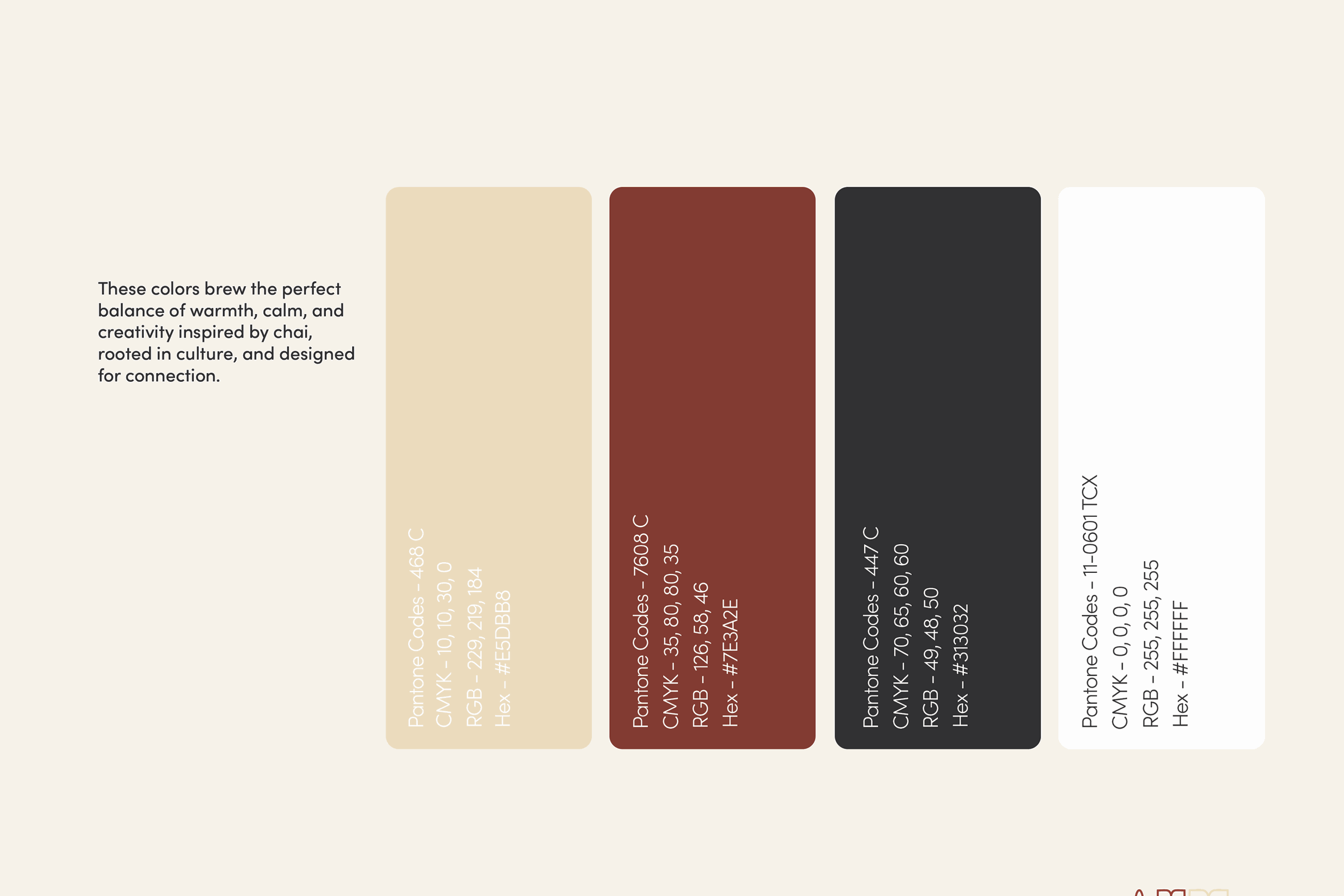
The full palette: terracotta with a sand, a deep maroon, a near-black and a white, each with its Pantone and hex
The set
The typography page: Sofia Pro shown as a full character set, upper and lower case and numerals, with its four weights
Sofia Pro
The type scale: Sofia Pro at 46, 56, 66 and 76 pixels beside the note on why a geometric sans with rounded edges suits the brand
Scale
Image: counter in place